My proof copies came in the mail today. I spent hours writing an overdue essay before allowing myself to open the box. I was happy with the proofs except for two small things, so I'll get those out of the way.
1. My map was still low resolution. That's my fault for not having proper programs.
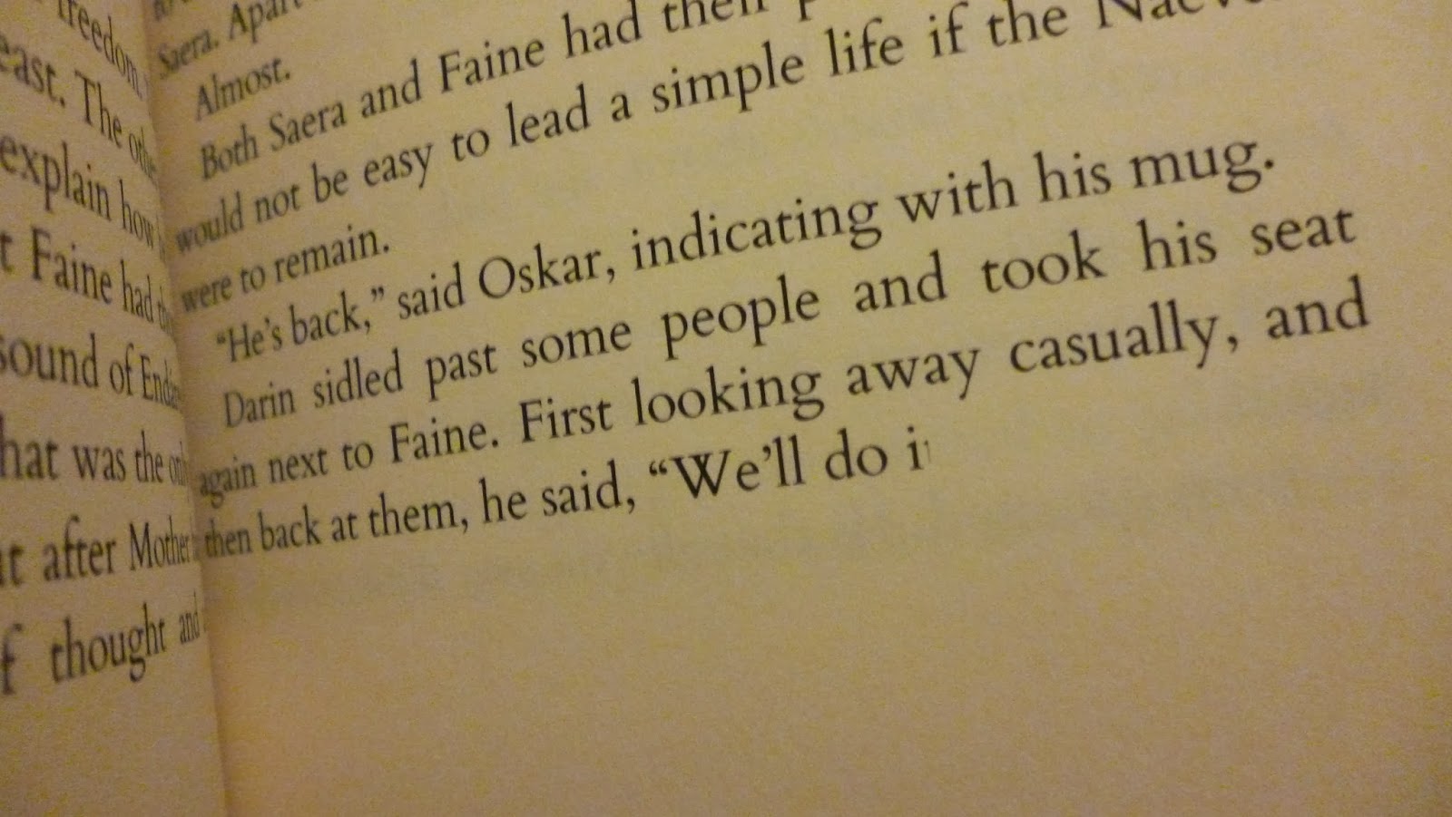
2. The end of more than half the chapters had part of the last letter and the punctuation mark cut off. That may have to do with my font choice. I mean, it's not a cover problem, so nothing to worry about there. I've emailed CreateSpace about it to see if they can sort out the problem.
Now for the cool stuff!


1. My map was still low resolution. That's my fault for not having proper programs.
2. The end of more than half the chapters had part of the last letter and the punctuation mark cut off. That may have to do with my font choice. I mean, it's not a cover problem, so nothing to worry about there. I've emailed CreateSpace about it to see if they can sort out the problem.
Now for the cool stuff!
Here's the box.

Tada!

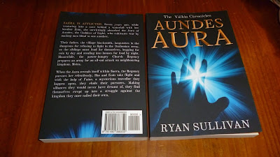
The front and back. The book on the left will be left mostly untouched. The one on the right I will read through to see how it fares after handling.

The map, along with the new notice pointing readers to the pronunciation guide at the back.

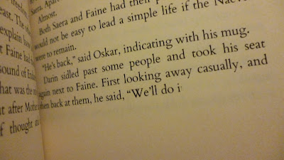
The Chapter One spread with the new font and formatting.

A spread from the middle of the book.

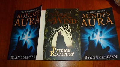
Side-by-side comparison of the glossy cover (left), a traditionally published matte cover book, and Aundes Aura with its matte cover.

So far I'm happy with the cover lift. It's more natural. I'll post what it looks like in a week's time or so.

Overall, I'm very happy with it!


